Sidebar
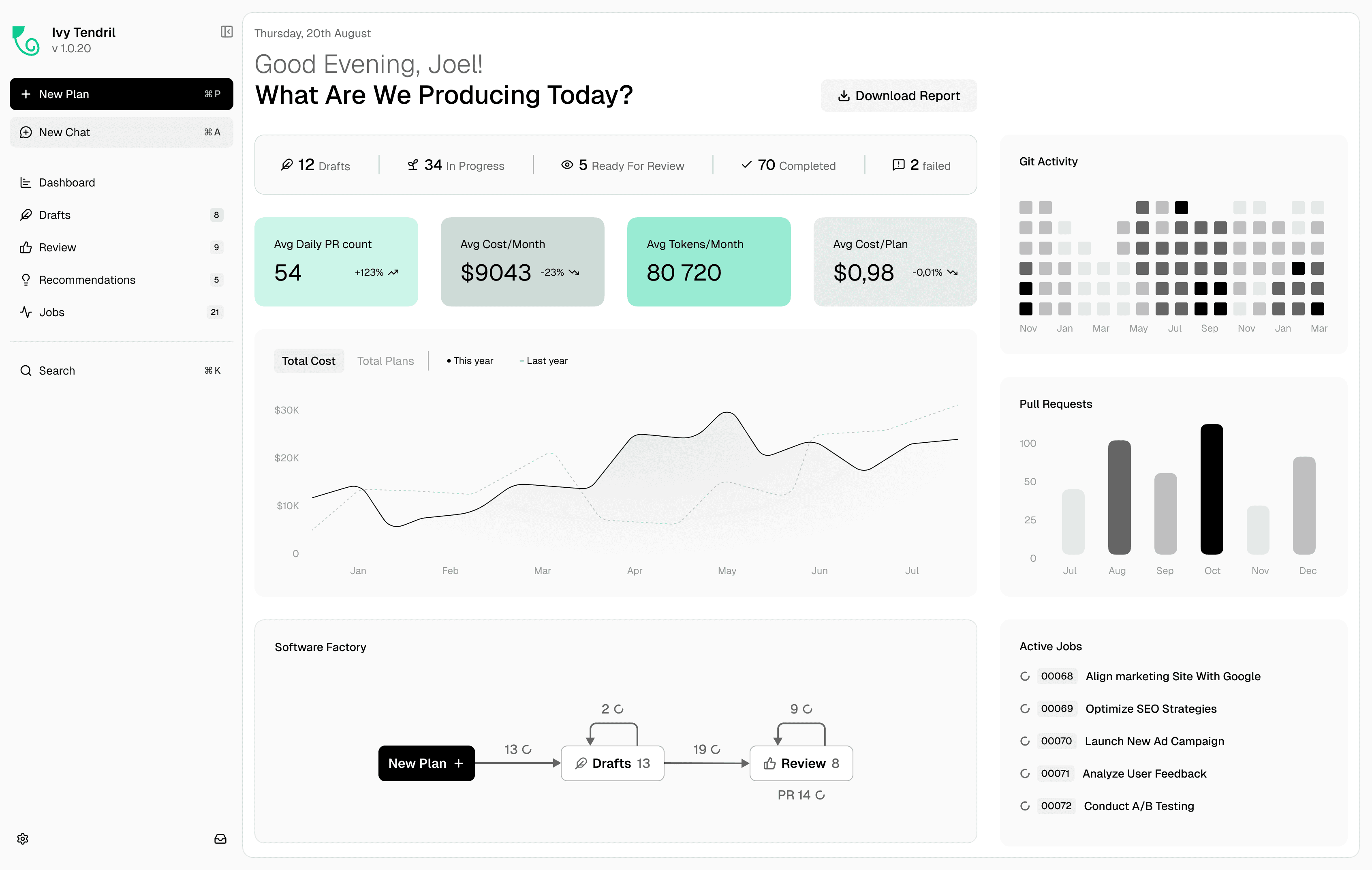
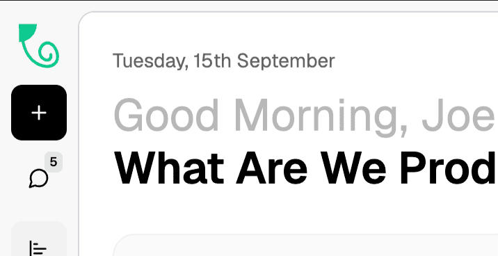
The navigation of Ivy Tendril in two states: an expanded panel and a collapsed rail.
- Role
- Founding Design Engineer
- Company
- Ivy Interactive
- Year
- 2026
- Stack
- C# / .NET 10, Ivy Framework, React 19, TypeScript, Tailwind CSS
Tendril holds plans, reviews, chats, jobs, recommendations, and a dashboard. I designed and built the sidebar that holds all of it in two states: an expanded panel with sections and counts, and a collapsed rail that keeps every destination one hover away.
Collapse
Discovery. Reviewers on 13-inch laptops reported that the diff view was too narrow with the sidebar open.
Problem. The sidebar used a fixed width, and hiding it completely removed navigation and counts.
Solution. Command B collapses the sidebar to an icon rail. Labels fade as the panel narrows, count badges move to the icon corner, and the content column grows in the same motion.
Chat flyout
Discovery. With the rail collapsed, switching between chats took three clicks: expand, pick, collapse.
Problem. The collapsed state hid the chat list entirely.
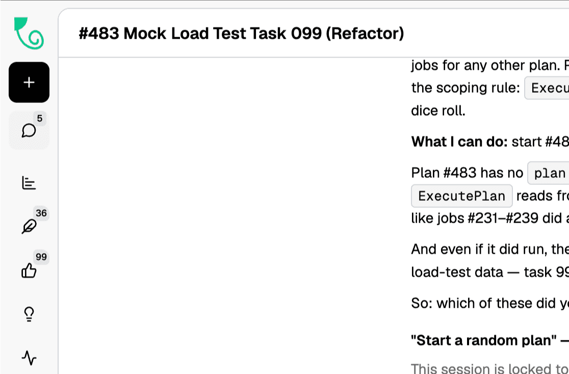
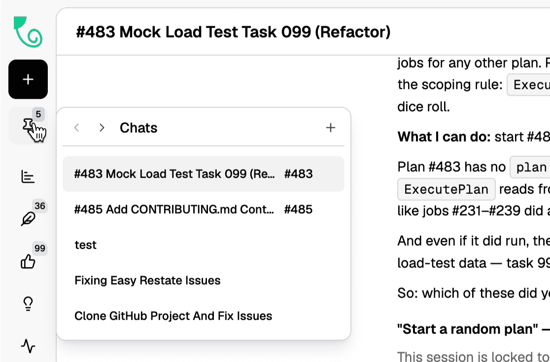
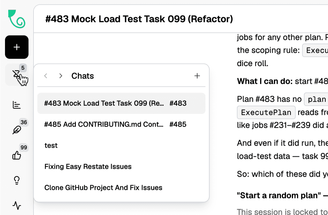
Solution. Hovering the chat icon opens a flyout with recent chats, previous and next navigation, and a new chat button. Clicking the icon pins the flyout open, and the icon turns into a pin.
Expand control
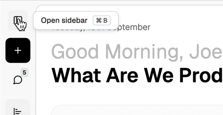
Discovery. In usability tests, two of five participants could not find how to reopen the sidebar.
Problem. The rail had no room for an open sidebar button.
Solution. Hovering the top of the rail swaps the logo for the expand icon, with a tooltip that names the shortcut.
Resizable list
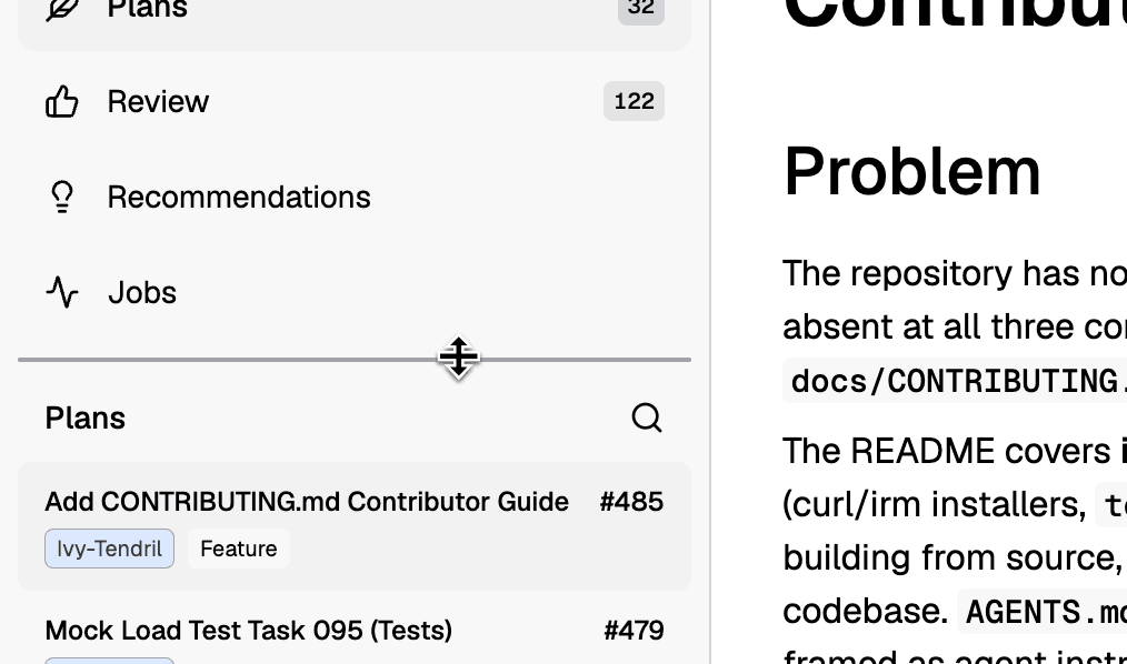
Discovery. One user with forty open plans wanted to see more of the list. Another with three plans wanted more room for navigation.
Problem. A fixed split between the navigation and the list suited nobody.
Solution. A drag handle between the navigation and the list sets the split. Plan rows show the number, the repository, and the type.
Row menu
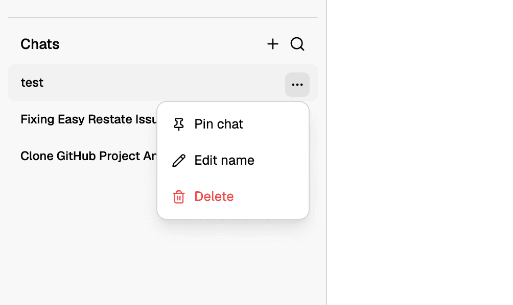
Discovery. Support tickets asked how to rename or remove a chat.
Problem. Rows had no actions, so cleanup happened in the config folder.
Solution. Each row has a menu with pin, rename, and delete. Delete is red and last. The same menu component is used everywhere in the app.
Result
The sidebar is also where Tendril's shared components for tooltips, badges, key hints, and icon buttons were consolidated into single implementations.